In the fast-paced world of business, where first impressions are everything, a brand’s visual identity can make or break its success. Design agency Pink Pony Creative dares to be different as highlighted in a recent branding project for raw dog treat company DoPaw.
“We wanted their branding to stand out from competitors and be truly unique,” says Founder and Chief Designer at Pink Pony Creative Kristy Campbell.
Campbell believes in designing with a purpose, an intention that goes far deeper than just creating something visually appealing. Every project begins by understanding the client’s brand, values, and goals.
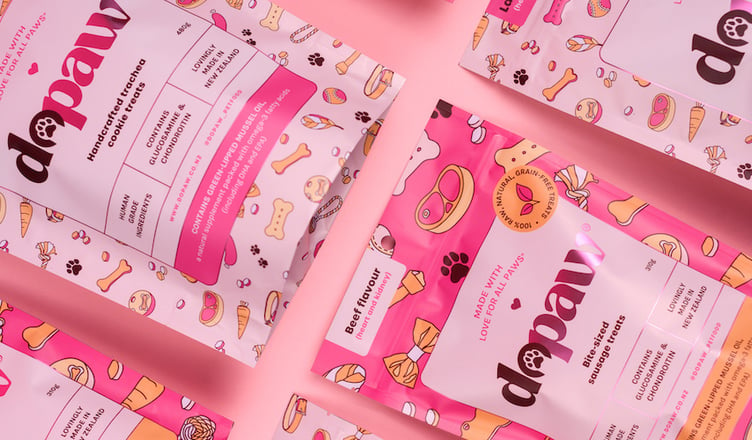
Enter DoPaw, a premium dog treat company specialising in freshly made, raw, healthy pup treats with a touch of pink.
The partnership between Pink Pony Creative and DoPaw was a seamless fit due to DoPaw’s commitment to using human-grade ingredients, which are backed by scientific research. This shared ethos ensured that the collaboration was embedded with integrity and quality, delivering exceptional products to pet parents (and dogs).
Raw dog food doesn’t always look appealing, no matter how good the ingredients are, so the two teams set out to create packaging that upped the glamour. Campbell worked alongside DoPaw Founder Lou, to find out everything that the brand stands for to bring the branding vision to life.
“One of the biggest strategies within our brand identity process is our discovery sessions. Where we best get to know the client and the brand,” Campbell says. “Who is DoPaw? What does DoPaw bring to the table? We imagine our brands like people, what they look like, what colour is their hair, how they walk, how they talk etc. Once we nail this, we can then pull these ideas throughout the branding to visually portray this ‘person’ (a.k.a the brand). We do this through every touch point, the logo, colour palette, typography styling, supporting graphics and illustrations. By making everything within the brand work as one, you provide the audience with a feeling for a brand, rather than just a logo.”
Lou from DoPaw says: “We wanted to fill the gap in the raw pet food market and bring some glamour to the industry, so we set out to create raw treats that were glamorous both inside and out”.
DoPaw’s vibrant and vivid colour scheme sets it apart from other pet industry brands, making it easily recognisable on store shelves.
“By making everything within the brand work as one, you provide the audience with a feeling for a brand, rather than just a logo.”