Logo redesign can be a controversial business – as we saw from Jaguar in late 2024 – but it’s rare for brands to be forced to reverse course. Here are three prominent rebrands that went horribly wrong, and a Kiwi success story.
Gap
Facing a drop in sales after the global financial crisis, clothing and accessories retailer Gap decided to change its logo of 20 years’ standing in October 2010. The change lasted less than a week before it switched back
to the previous logo, released in 1990.
Tropicana
Fruit juice brand Tropicana, owned by PepsiCo, unveiled a brand-new packaging design in January 2009. The new design triggered a consumer backlash and sales slump, leading Tropicana to announce in late February that it was going back to its previous packaging.

Kraft
Continuing with the post-GFC theme, Kraft Foods underwent no less than four logo redesigns in four years between 2009 and 2012. After the third of these logo changes received poor reviews, it went back
to something like its logo from 2009.
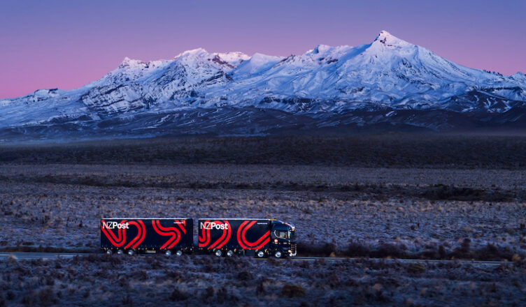
Local success for NZ Post
The Inhouse team know how complex logo and brand redesigns can be, having worked with some of New Zealand’s best-known brands.
One of their biggest projects was when they created a new brand identity for NZ Post in 2021, which saw NZ Post, Courier Post and Pace all brought under one banner.
Arch MacDonnell, Inhouse founding partner and creative director, describes NZ Post as “a really physical brand”, in contrast to some of Inhouse’s other clients like Meridian Energy.
“Meridian Energy doesn’t actually have many tangible physical outputs. There’s no Meridian store, so that lives in the ether in a way – it lives in the digital space,” he explains.
“With New Zealand Post, there’s probably not a brand with more touchpoints than that one. There’s trucks, there’s vans, there’s guys in uniform, there’s packaging, there’s post boxes everywhere.”
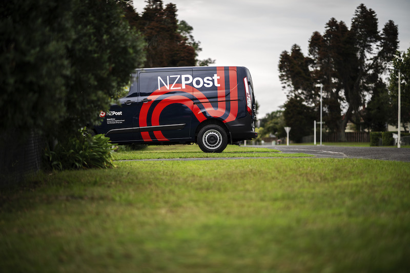
MacDonnell says NZ Post’s brand redesign needed to reflect its changing business focus, with its mail delivery service shrinking while its courier business was experiencing massive growth.
“The old logo with the envelope really anchored them to a side of the business that was declining.”
They also created a new extended colour palette to distinguish NZ Post from courier companies with similar colour schemes. But the red ‘button’ on the logo had to stay, as research showed it had “massive salience”, according to MacDonnell.
“It made sense for it to stay in a button from our perspective, but we needed to change the envelope, so we ended up developing this P mark.
“The idea is it’s a symbol for the road network that the post gets delivered on. It’s the symbol for
a ribbon that you might wrap a package in.”

This story was published in NZ Marketing magazine issue 82, March-April 2025. Why not subscribe? Get four issues a year delivered for just $50 if you autorenew. Essential marketing intelligence. Don’t miss it.