It seemed like everyone had an opinion about the new Jaguar logo. But what can we learn from it? Kiwi design experts have their say on what local brands can take away.
‘Oh f… Jaguar, what have you done?”
Marketing professor Mark Ritson captured much of the reaction to Jaguar’s brand refresh.
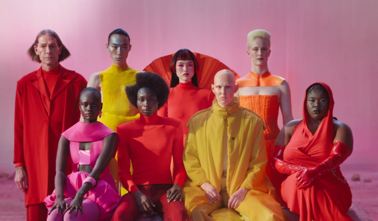
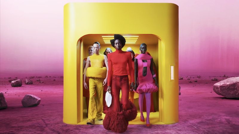
The iconic luxury car maker signalled its new direction in a 30-second video released late last year, featuring a group of high fashion models dressed up like residents of The Capitol in The Hunger Games.
It also unveiled a new-look logo, controversially missing the famous jaguar emblem. What the “Copy Nothing” promo didn’t feature was cars.
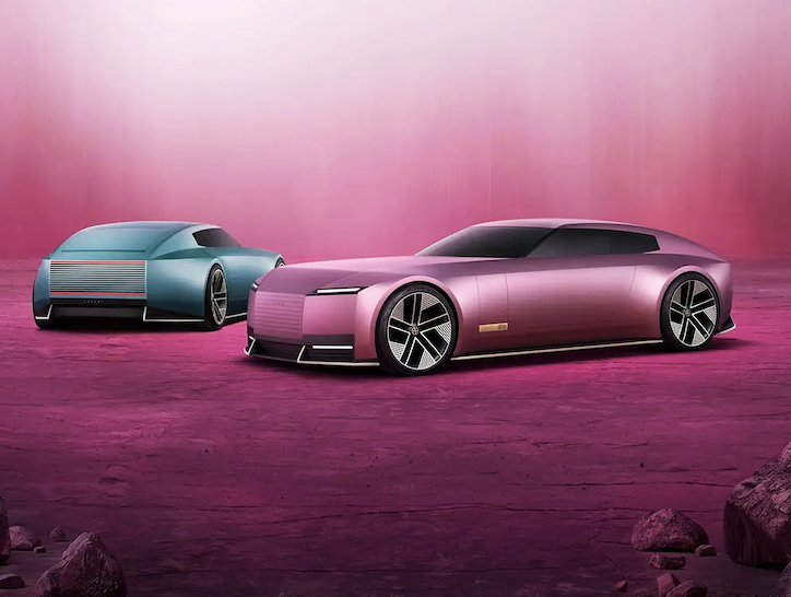
While Jaguar did soon reveal its Type 00 concept car (to similarly divided reception), some marketers believe the car brand has gone too far too quickly.
Ritson v Morris
Ritson, a guest judge at the YouTube NZ Marketing Awards 2024, wrote in Marketing Week that Jaguar needed to start out with a clear respect and appreciation for its heritage.
“Yes, Jaguar is shifting to electric rather than petrol powertrains. But the DNA of the brand and its codes don’t change because of this,” he wrote.
“When Hennessy moved from barrels to bottle (just as seismic a move back in the day), the brand kept its signature style and position. Indeed, in times of great product change, you want to play up these established markers all the more.”
But others applauded Jaguar’s move, including Forbes contributor James Morris who described it as “absolute genius”, noting the huge amount of global attention it had received.
Morris pointed out that Jaguar has been a drag on the performance of parent company JLR: while sister brands Range Rover and Land Rover are both profitable, Jaguar is making a loss.
“If a brand isn’t profitable, that by implication means its existing customer base doesn’t provide sufficient financial benefit. To all those who complain about alienating core customers, they weren’t really working out for Jaguar anyway…
Kiwi reckons
New Zealand branding experts also had Marmite-y reactions.
Some agree that Jaguar might be wasting its valuable brand legacy by making such a radical shift so quickly.
Kaleb Francis, Head of Strategy at branding and creative agency Marque, says Jaguar is deliberately shifting away from the older market into a new one, and the repositioning is tied back to its overall business strategy.
“From my perspective, brand repositioning should be something that is gradual or iterative because you’ve got all this awesome brand legacy of Jaguar, and you’re kind of chucking it out.
“All of that work that was built up, all of that equity that was built up over so many years is totally gone. And that’s a question you need to ask when you’re doing the strategic work: do we want to retain it, or do we want get rid of it? What is the cost of not retaining it?”
DDB Aotearoa Chief Creative Officer Gary Steele says he “didn’t think it was as bad as everyone thought”, instead seeing the campaign as an effort to signal an internal change at Jaguar as well as trying to reach new buyers.
“Obviously they want to attract the future audience of Jaguar and not the past audience.
“What I think they’ve done potentially is alienated the actual drivers, the Jaguar drivers and lovers of that car.”
As for the jaguar-free Jaguar logo, Steele says the new one is a bit more modern, but he believes there could have been a “mid gap” to bridge the versions.
“They could have got people comfortable first with slight changes and then moved towards the bolder version. Some design companies will go from A to Z, when actually you might need
to go A to D and then from D onwards.”

Brave move
Meanwhile, Arch MacDonnell and Toby Curnow, of boutique graphic design studio Inhouse, applaud Jaguar’s decision to make such a radical change to its brand.
“We don’t love the design itself, but we admire the bravery because they were a brand that was not selling cars, particularly in the US,” says MacDonnell, who founded Inhouse in 1995.
“They were just falling off a cliff, so they had to do something, and they did something radical.”
Curnow, Design Director at Inhouse, says Jaguar is trying to reposition itself as an ultra-premium brand, to compete with the likes of Bentley, and at the same time moving to an all-electric platform. The existing brand didn’t reflect the new positioning or product design.
“There’s those two layers of it and when you’re in that kind of situation, it’s a total refresh.
“In some ways it’s like the situation Apple were in when Steve Jobs took back his position, because it’s the ‘Think Different’ moment for them – getting back to what they stand for.”
Giving it 100%
One of the most successful Kiwi brands internationally is Tourism New Zealand’s ‘100% Pure New Zealand’, which has been enticing visitors for 25 years.

Brodie McLeish, General Manager, Marketing at Tourism New Zealand, says having something “iconic and consistently recognisable” has played a significant role in the success of our tourism sector over that period.
“We are an extremely niche destination. We are only 0.3% of all outbound international travel, so the ability to stay consistent, to stand out on the world stage is so important for us.
“Chopping and changing the logo and tagline every few years isn’t in our best interest.”
The logo evolved in 2015 when renowned New Zealand typographer Kris Sowersby designed a special font, with artist and carver Rangi Kipa carving the letters from kauri.
McLeish says the four pillars of the 100% Pure New Zealand brand are the people, the culture, the experiences and the epic landscapes. Over time, the indigenous Māori culture and the warmth of the New Zealand people have come to the fore.
“For a long time, we just focused on our big epic landscapes, but what we heard time and time again from visitors that had arrived here, was they came for the landscapes, but they left talking about the people.”
Simple v samey
While 100% Pure New Zealand’s logo was carved in native timber, the rise of digital media is one of the factors driving a big trend in logo design: simplification.
Steele, of DDB, says this trend has been evident in fashion, with iconic brands such as Yves Saint Laurent and Balenciaga moving towards similar, bold fonts.
“Some fashion brands were very elaborate in terms of their logo types, but they had to get simpler for phones and laptops and screens.
“But over time our pixel and screen resolutions got better.”
With the technology improving, Steele says brands could revert to more distinctive logos, as Burberry did in 2023, when it reintroduced the knight back into its logo.
“There’s so much in that identity that you can visually tell the story and if you simplify too much, you lose it all and then you just become wallpaper.”
Curnow, of Inhouse Design, says motion and the ability to animate is increasingly a consideration in logo and brand design, as technology evolves.
“You could also say that there’s been a general trend towards getting back to brand essence, both in terms of the concept of the brand, but also visually in this brand that you know and love, what are the things that really make it what it is?
“We’ve also seen brands zigzagging the other way and going to more exuberant and animated, colorful brand work. I think Jaguar is an example of it. It’s probably something that is influenced by the Instagram and TikTok world.”
Stick to the strategy
So how do brands get their logos right? Marque’s Francis says branding has to deliver against the business strategy.
Objectives might include raising awareness, winning market share or even internal engagement, but ultimately it has to increase shareholder value, he says.
“Without that strategic process, you’re going to get a bunch of elements that might look nice, but have very little to do with the brand and the business strategy.
“Looking good is great, but if you don’t know why you’re looking good or why people should listen to you or look at you, then just like Jaguar, they’re going to be really, really confused.”
This story was published in NZ Marketing magazine issue 82, March-April 2025. Why not subscribe? Get four issues a year delivered for just $50 if you autorenew. Essential marketing intelligence. Don’t miss it.