As the way we shop changes, the role of packaging is evolving. Minimalism is out, bright and bold is in, as designs need to stand out both in-store and on social media.
There are few forms of packaging more generic than egg cartons, but one New Zealand brand made a big call that has helped it cut through in a crowded market.
Developed by design agency Likeminds, it’s hard to miss Better Eggs’ distinctive yellow, purple and green cartons on supermarket shelves.
Better Eggs is proudly free-range and SPCA certified, and its cartons reflect its values, says Likeminds co-founder and strategy director Noel Blackwell.
“When we started working with Better Eggs, the category was all basically one or two colours,” he says.
“This was about a brand trying to bring the foodie fun of truly free range eggs into the market and actually make eggs feel delicious and enjoyable, rather than this sort of flat monochrome barnyard thing that was going on.
“As a team, we decided to sink the majority of the budget into sourcing more sustainable but brightly coloured cartons from Denmark. We wanted to design a piece of packaging that you didn’t want to hide in a cupboard – you wanted it out on your tabletop.”
Blackwell says Likeminds looks at the whole process of designing a brand as an opportunity to tell a story, and packaging plays a critically important role.
“One thing you can’t get away from with packaging is that at some point in time, generally point of purchase, it is everything,” he says.
“You’re about to buy something, you’re going to choose something, it’s this one or that one. In that moment, packaging has to be the ultimate powerful boildown of the offer. It’s a lot more direct than a lot of other things that we design.”
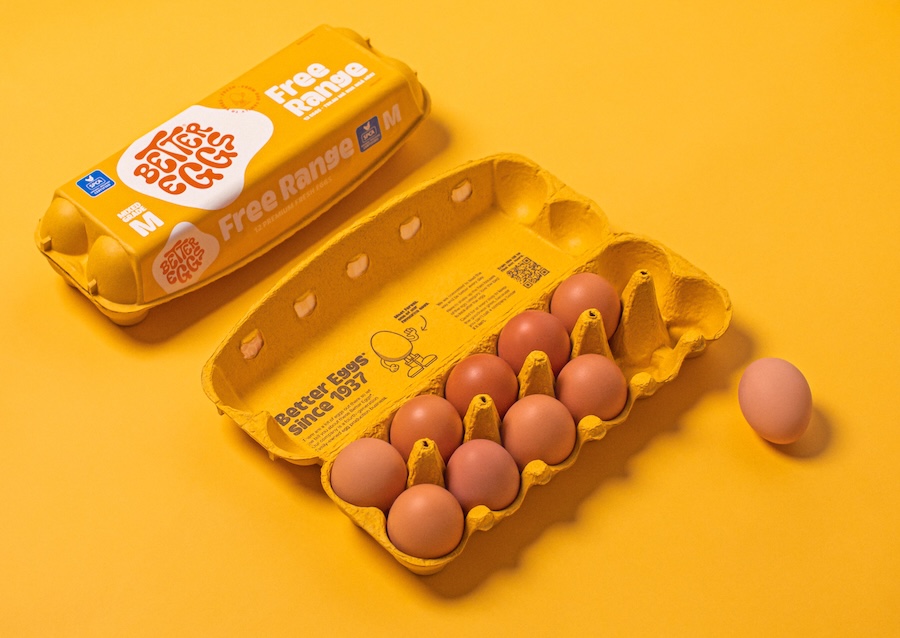
Better Eggs wanted to bring a sense of foodie fun to free range, and colourful packaging helps tell that story.
Pendulum swing
Better Eggs isn’t the only brand embracing bright colours. Matt Grantham, creative director of Onfire Design, says packaging design is swinging back towards boldness after a “minimalist drive” during the Covid era.
“During Covid, there was a psychological desire to feel safe and taken care of, because you were detached from a lot of people,” he says.
“A lot of brands were really stripping back to as minimal as possible – pastel colours, warm, fuzzy, very friendly, not shouty at all.
“But in the past year, the scale’s flipped. We’ve gone maximalist design and there’s some really cool colour, big colour, big typography, being as bright and bold and friendly and as punchy as possible.”
Grantham has observed a related trend: brands taking a ‘craft’ approach with their visual assets. This is especially true with some FMCG challenger brands in America and the UK.
“You could argue that it’s a bit of an attack against all this AI,” he says. “I’m seeing a lot of brands using expressive illustrations as key design assets, but they’re obviously very much hand-rendered. So there’s that idea of there’s human behind this brand – it’s not all done with AI.
“Businesses as big as Apple are intentionally calling out a lot of their campaign work as ‘designed by humans’.”
Another key packaging trend since the Covid era is around provenance and emphasising the local, especially if products are made in that country.
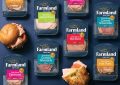
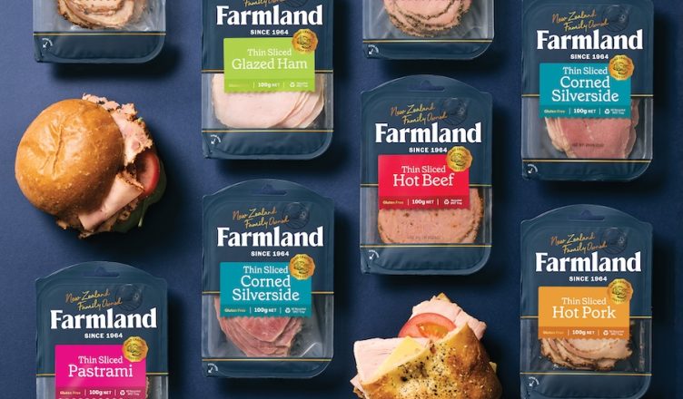
This aspect was front and centre when Onfire Design worked on a big refresh for smallgoods manufacturer Farmland Foods.
“The major part of our strategy was to reinforce the Bulls, Rangitikei, provenance of that brand. That whole storytelling showing and being proud of where it actually comes from,” Grantham says.
Sustainability goes mainstream
Sustainability is becoming a major consideration across the marketing sector, and packaging is no exception, according to Richard Francis, design director for Likeminds.
“I worked on an Ecostore project a couple of years ago. For them sustainability is obviously a key driver across all aspects of their business, with their packaging front and centre.
“That’s a pretty big trend across a lot of different brands now, whereas that was less common in
the past.”
His project for Ecostore was around ocean waste plastic. The company partnered with a global ocean waste plastic recycler and then used it to create packaging for their hand soap.
“Every year they were releasing limited-edition hand soaps and this particular year they were developing a bottle using ocean waste plastic rather than their usual sugar-based PE.
“I think this awareness that consumers want more sustainable packaging is now more commonplace across FMCG.”
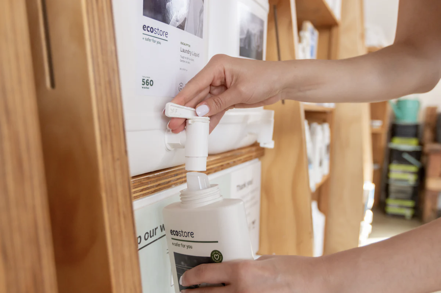
Ecostore leans in to the growing appetite for reusable and recycled packaging.
The way people work with plastics has changed a lot, with advances in technology allowing for a wider range of uses, Francis says.
“I remember 15 years ago when natural plastics were technically available, but limited in what they could do. Today, the production and material technology seems to have advanced a lot and they can now rival petroleum-based plastics for lots of applications.”
Embracing sustainability can mean eschewing single-use packaging altogether. Some brands are now using refillable/reusable bottles and pack formats, and Grantham of Onfire Design says this can solve several problems.
“If you can create packaging or dispensing formats which you don’t have to throw away, that’s brilliant. We’re currently working on a couple of projects which are embracing this as a key brand principle, and this comes down to the inks you use.
“These ideas are great aspirations for today’s brands. But packaging, at its core, still has to be easy to fill, easy to manufacture, easy from a logistics point of view. So it’s got to do all of those, but there’s still possibilities in terms of rethinking that format and ease of use.”
Grantham says this trend is particularly popular in the cleaning aisle.
“You buy in small refillable tablets, capsules or bottles and then simply add water. Some intuitive person saw that cleaning fluid or cleaning spray is 99% water – so why would you buy a full bottle when the raw ingredients can be made, packaged, shipped and sold in much smaller, planet-friendly formats? This thinking is starting to permeate into other retail aisles too.”
Grantham says many of these trends start in larger markets such as America, Europe and the UK and filter down to New Zealand.
“This usually stems from a bigger international brand innovates with their packaging, production houses deliver new packaging technologies, or a challenger brand upends the status quo of how things are done. Then others follow. What was a small packaging shift gains momentum and permeates globally.
“For New Zealand brands, it is an opportunity to see these fringe ideas become mainstream, see if this can help their brand. They can see how to make it happen from a manufacturing perspective and insert this shift into business growth plans.
“I love to see new innovation in retail aisles. It makes me sit up, take notice and – more importantly – to engage with that brand.”


A dose of reality
Packaging is an important part of a company’s brand, but it is also subject to physical and technical limitations including shape and materials.
One of those navigating the path from great ideas to workable solutions is Mat Bogust, design director at Think Packaging, who specialises in structural packaging design.
“We are the architects of the box: the form, the shape, the creases, the protection, the sexiness, the expansiveness, the cheapness… It depends what the brief is,” he says.
“We often ask clients, ‘Have you thought how it’s going to be made?’ We try not to crush big ideas. Big ideas are good, but you have to be aware of the constraints.”
Bogust says practical limitations are why a lot of boxes look the same in stores and supermarkets.
“All the technical elements mean it’s hard to change the form. So it becomes about making the box prettier than the next one on the shelf.”
As more shopping moves online, ecommerce packaging is becoming more important, he says.
“Ecomm products are easier to make a bit more fun,” says Bogust. “If a custom box comes up that’s printed and you have a moment to open it in a certain way and it excites you, then that’s like walking into someone’s fancy store.”
And a package that is a delight to open can become customer-created, shareable content, with ‘unboxing’ videos still doing the rounds on social media.
“We often tell our clients not to forget that, because that’s the first touch point of making it memorable,” Bogust says.
“People video it, they will Instagram it, they’ll film opening the box. If it looks bad, then they won’t post it. But if it’s cool, you’re more likely to get something. There are millions and millions of unboxing videos.”
An afterthought
Bogust says it’s easy to spot brands that haven’t invested in packaging.
“We see a lot of packaging is an afterthought – from the form to the palette to the material,” he says.
“It just becomes, ‘We need to do it quick, and it needs to be cost effective,’ rather than considering it as part of the whole brand, with the packaging being an extension of the brand itself. People forget that important step.”
Bogust has a simple plea to brands when it comes packaging design: “Stop making things shit.”
You’ve poured hours into the thing you’re selling, so: “If you’re going to make a package for a product, that’s its home – make it a bloody good one.”


This story comes from NZ Marketing magazine issue 86, March-May 2026. Why not subscribe? Get four issues a year for just $50 (including delivery) if you autorenew.
Essential marketing intelligence. Don’t miss it.