Phantom Billstickers co-general manager Tom Horton knows what makes an awesome poster – and why following the design rules doesn’t always produce one.
Many posters are invisible before they hit a wall.
They’re designed in studios, approved in boardrooms and optimised for a screen that’s six inches from your face. The grid’s clean. The hierarchy’s textbook. The logo’s big enough so everyone’s comfortable.
Then it goes up in the rain on Wellington’s Cuba Street and it vanishes. Nobody stops to look. More often than not, the people who made it never even see where it ends up.
Start with the wall
A poster is not some graphic design that happens to end up outside. It’s a response to a place.
I’ve watched beautifully designed posters disappear on the wrong wall, and rough, hand-drawn work zing on the right one. The difference is almost never the design. It’s whether anyone understood where it would go.
The fundamentals matter, of course – contrast, legibility, restraint – but they’re the floor, not the ceiling. Tick every box in the design textbook and it’s no use if you’ve never stood where the thing’s going to live.
The ones that cut through
Some of the best work I’ve seen broke the rules on purpose. Not because the designer was lazy. Because they understood the destination well enough to know which rules were getting in the way. Here are a few.
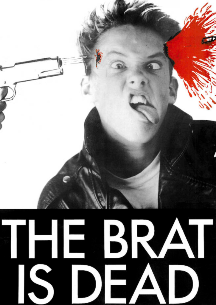
‘The brat is dead.’ No grid. No hierarchy. A jarring photograph, a red splash, three words. Every design principle violated. On a wall surrounded by carefully art-directed commercial work, it was the only thing anyone looked at.
The John Cooper Clarke poster pulled the same trick in reverse – the type’s buried inside the illustration, tangled up in the mess of hair.
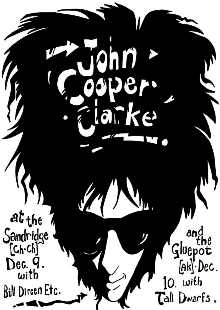
Try separating the design from the subject. You can’t. Both broke every rule of composition. Both are burned into the memory of anyone who sees them.
Then the activism work. ‘Stop French testing.’ ‘No more Hiroshimas.’
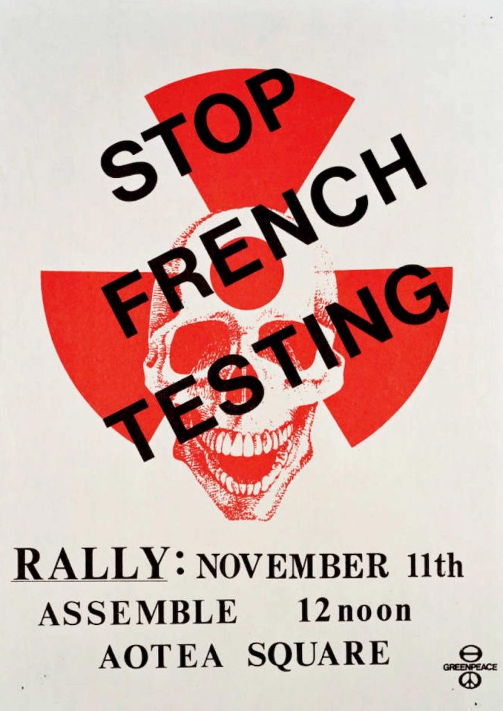
A skull jammed into a radiation symbol. A hand in raw brushstrokes against black. These weren’t designed to be good posters. They were designed to make you feel something. Wedged between gig listings and beer ads, the rawness hit harder than anything polished ever could.
No headline
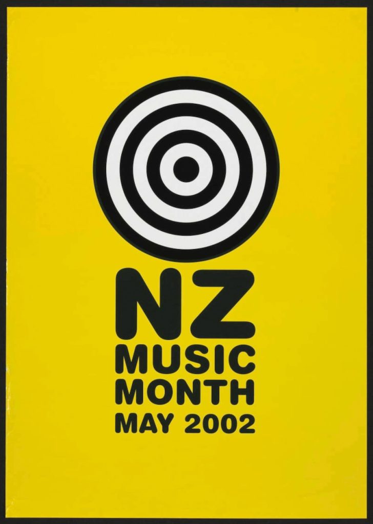
‘NZ Music Month 2002’ is the complete opposite. Solid yellow. One bullseye. It said almost nothing yet was the loudest thing on the wall.
Two decades on, Karen Walker ran the same play: no headline, no call to action, just the image and the name. In a world screaming for attention, silence is a power move.

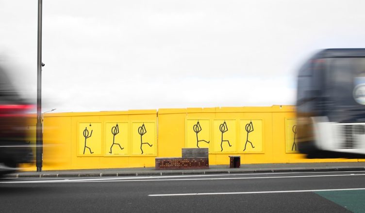
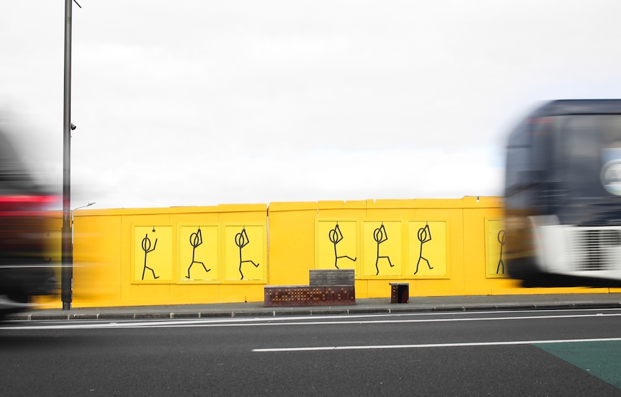
More recently, the Pak’nSave Stickman flipbook turned a wall on Auckland’s Karangahape Road into animation – the movement only visible as you walked past. It completely broke what street posters are supposed to do. It worked because someone knew exactly how people move through that stretch of road.
Every one of these examples ignored the textbook. None of them were reckless. They were specific.
Still here
Formats come and go. Platforms rise and collapse. The poster’s been here the whole time – on the wall, in the weather, part of the street or your bedroom.
It can’t be skipped, swiped, blocked or optimised. No login is required, and no wi-fi is needed. Just a wall – and something worth saying.
The tools have changed. The principle hasn’t. Put something worth looking at in a place that matters, and people will stop. That’s it. That’s the whole job.