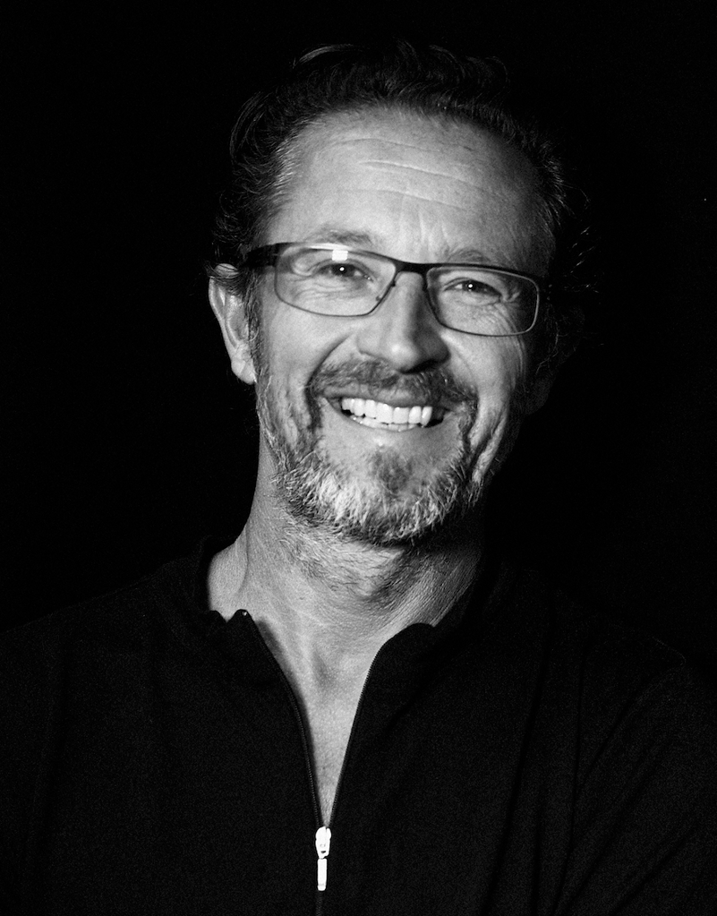
Although still early days, Vodafone New Zealand’s rebrand to One New Zealand has already been iconic. We speak to creative lead, Nick Worthington, about the reinvention, and discover what’s got both the industry, and nation, talking.
Vodafone’s ongoing journey to becoming One New Zealand ultimately began three years ago when Infratil and Brookfield bought Vodafone NZ off Vodafone Group and appointed Jason Paris as CEO.
Since then, a rebrand has always been on the cards – it’s just been a matter of when.
Leading the One NZ team through the rebrand is Andrew Stone from TwoViews, who seconded Nick from The Tuesday Club to be creative lead over a year ago. “Just when it got super interesting,” Nick says.
Having recently founded the The Tuesday Club, Nick found himself in the privileged position of being able to choose who to work with and “people who are going to help make the world a better place”. Jason Paris and
Andrew Stone both fell into that category he says.
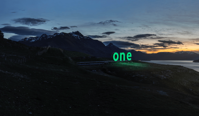
So behind closed doors and with a tight NDA, Nick and the team set about creating a brand-new world for One NZ with the goal of making sure 90 percent of the country were aware of it.
“The hardest thing was working as a secret team because any name or any changes that we were contemplating or considering, we had to keep secret. No one knew what we were doing, and that meant keeping it secret from the whole Vodafone organisation, as well as journalists and competitors.”
Having only a small working group of around 20-25 people who truly knew what was going on made it both “very challenging and quite a bit of fun”.
“We brought in design experts, mnemonic experts, film experts, and cultural experts, just as we were developing it. The designs were developed with Misterwolf and the film elements developed with The Glue Society.”
The team then reported back to the board and the CEO on a regular basis as ideas developed.
Because the company wanted the rebrand to recognise the separation from Vodafone NZ while staying connected to Vodafone International, Nick says it was about creating a new brand “that acknowledges where you come from, but also kind of guides you to unchartered waters where you’re headed, where you want to be”.
A unique element of this rebrand is that it is happening over an extended period of time rather than overnight. “This is going to be a much more evolutionary, collaborative experience,” Nick says.
“The things we’ve started with are the only non-negotiables. That’s the name and the new logo. Exactly how the company grows into its new skin is going to be defined by all the people that work with the company, for the company and its customers.
“It’s enormously difficult to transition a brand overnight, and contractually, to have two logos in the market, et cetera. It’s a logistical nightmare.”
That’s why the decision was made to introduce everyone to the idea early, and change over a period of time, allowing it to be an organic process which fits with the “consultative, united” ethos behind the new brand.
“Allowing everyone to come on board, not making all the decisions for people. Not saying this is it, but just saying, ‘Let’s build it together.’ That’s become enormously useful, and it’s become the thing that’s actually going to give [the brand] its meaning.”
So why One? Well, there are a multitude of reasons Nick says. “When I look at the word ‘one’, I see the last three letters of Vodafone and the future – in a different colour – the colour of New Zealand.”
And it’s that change, while maintaining a subtle connection, that One New Zealand is aiming to represent as a
new New Zealand company.
“When you’re a global company, largely run by the mothership or the global brand operating in New Zealand, to be able to be a New Zealander for New Zealand and to behave like a New Zealander and make every decision as a New Zealander for New Zealanders is very difficult,” says Nick.
It’s this New Zealand-ness that One New Zealand is striving to represent using the original Vodafone logo of a speech mark turned 90 degrees to portray a Kiwi.
“I was on my scooter outside the Vodafone building one rainy morning, looking up at the great big Vodafone logo on the side of the building. I’d been talking with Jason and the team about New Zealand-ness and then I saw the logo change in front of me, in my mind.
“I drew it for the team when I got into the building and said, ‘Can you see what I see? Does this make sense?’ And they went, ‘Oh my God, that’s cool.’
“Basically, that unlocked going from a global speech mark to a New Zealand icon. Global giant to a Kiwi champion.”
For Nick and the team this signalled being able to move beyond what had been a big immovable hurdle, which was that they couldn’t use the Vodafone logo.
“If the new logo is spun really fast it also spins into a blur with a white dot in the middle and a green outer ring. When it slows down the shape returns to a Kiwi or a speech mark, depending where you stop it,” Nick adds.
“It’s still a Vodafone logo and it’s still a Kiwi. It’s our transitional state and our new energised future state. It’s basically a symbol of energy. It’s alive. And over time we hope to be able to tell that story, well enough, often enough so that other people see that too.”
This article was originally published in the Dec/Jan 2022/23 issue of NZ Marketing. Click here to subscribe.